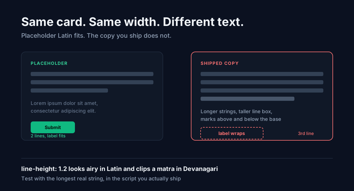
Lorem ipsum passes your layout. Then you paste the real Hindi copy in and the card grows a third line, the button label wraps, and a matra gets clipped at the top. Nothing broke. The placeholder simply never described the text you were going to ship.
That is the part most guides skip. Lorem ipsum is not neutral filler. It is a sample of one specific kind of text: lowercase Latin, short words, no ascending marks above the cap height, no descending marks below the baseline. If the copy you eventually ship is Hindi, Marathi, Bengali, or a mixed Hinglish string, you tested the wrong shape.
What lorem ipsum actually is
It is scrambled Latin from Cicero's De Finibus Bonorum et Malorum, written in 45 BC. Sections 1.10.32 and 1.10.33 are the source. A Latin scholar named Richard McClintock traced it there in the 1980s, after noticing that "consectetur" was an unusually rare word to find in nonsense text.
The reason it is on your screen today is more mundane. It appeared on Letraset dry-transfer lettering sheets in the 1960s, then shipped inside Aldus PageMaker templates in the 1980s. Designers used what was in the box, and the box had lorem ipsum in it. Forty years later it is the default in almost every design tool.
So the text is not chosen for typographic reasons. It is chosen because it was already there.
The two jobs people confuse
There are two different reasons to use dummy text, and they want opposite things.
Job one: hide the meaning. You want a client to look at spacing, hierarchy, and rhythm without reading the words and arguing about the headline. Lorem ipsum is genuinely good here. Because it is not English, your eye slides over it and sees blocks and greys instead of sentences.
Job two: test the container. You want to know whether the card, the button, the nav item, or the table cell will hold the real copy. Here lorem ipsum is close to useless, because the real copy has a different average word length, a different character set, and a different vertical footprint.
Most people use lorem ipsum for job one and then quietly assume they have also done job two. That assumption is where the bug lives.
Hindi is longer, and taller
Two things change when the shipped copy is Devanagari.
Length. Translating English UI strings into Hindi usually makes them longer. Short labels expand the most in relative terms: a four-character English word often becomes a longer Devanagari string once you count the vowel signs. This is why a button that fits "Submit" comfortably will sometimes wrap on its Hindi label, and why tight nav items are the first thing to break.
Height. Devanagari hangs marks above and below the base characters. Vowel signs sit above the headline stroke; some conjuncts drop below the baseline. A line box tuned to Latin lowercase does not reserve room for either. The W3C's Indic Layout Requirements document exists largely because of this class of problem: default line heights that look generous in Latin clip Devanagari.
The practical result is that line-height: 1.2, a value that looks fine and even
a bit airy in English body copy, can shave the top off a matra in Hindi. For
Devanagari, staying nearer 1.5 to 1.6 is the safer floor.
There is a second-order version of this that catches people out. If you set a
fixed pixel height on a card or a row to make a grid line up, the clipping moves
from the glyph to the container: the text is drawn correctly and then hidden by
overflow. Setting min-height instead of height costs nothing and lets the
row grow when the script needs it to.
What to actually test with
Use placeholder text in the script you are shipping. Three things worth checking before you call a layout done.
The longest real label, not the average one. Find the genuinely longest string that can appear in each slot and paste that. Averages do not break layouts; outliers do. If you need a block of a known size to compare against, generate an exact word count with the Lorem Ipsum Generator first, note where the container gives up, then swap in the real string and see whether it lands inside or outside that limit.
A mixed Hinglish string. Real Indian product copy is rarely pure Hindi. It is "₹499 ka plan", "recharge kar lo", "PDF download karein". Devanagari, Latin, a currency symbol, and digits in one line. That mixture is what actually ships, and it stresses font fallback in a way that neither pure English nor pure Hindi does. If your font stack lacks Devanagari coverage, this is where you find out, because the browser silently swaps in a fallback face with different metrics and the line jumps.
One deliberately absurd case. A 60-character name in a field designed for 20. You are not testing whether it looks good; you are testing whether it degrades predictably instead of overflowing its container.
Where lorem ipsum still earns its place
None of this means stop using it. For early layout exploration, wireframes, and any moment where you need a stakeholder to stop reading and start looking at structure, it is the right tool. Greek text has a real advantage: nobody proofreads it.
The Lorem Ipsum Generator on ToolMintX gives you three modes for exactly this stage, and the split matters more than it looks. Paragraphs for body-copy areas and article layouts, where you want to see how running text behaves down a column. Sentences for the medium slots, meaning a card description, a tooltip, a form hint, or a meta description, where a full paragraph is too much. Words for the tight slots: a headline, a button label, a nav item, a chip. Generating exactly the word count you expect is how you find out whether a real label of that length fits, before anyone has written it.
Use it for the greybox pass. Then, before you ship, replace it with the longest real string in the script your users actually read.
The short version
Lorem ipsum answers "does this layout have rhythm". It does not answer "will my copy fit". Those are different questions, and the second one is the one that files bugs after launch.
If your product ships Hindi, test with Hindi. If it ships Hinglish, test with Hinglish, currency symbol and all. Keep the placeholder for the stage where meaninglessness is the point, and drop it the moment you start making decisions about containers.